Monday 28 April 2014

The Prestune shopping precinct minibus of 1992/1972

PRESTUNE 1992?


I found this incredible video 'What will Preston look like in 1992?', posted by the Harris Museum a year ago, from the 1972 Preston Guild exhibition:

http://vimeo.com/47656089

'How will we be getting around 20 years from now?' The lady's voice asks in the video. There is an interesting mention, in the Shopping section, of a minibus driving around people in a covered shopping centre, to aid them travelling around the centre. I'm intrigued by the practicalities of that...

These imagined future/past histories intrigued me. I wondered what the Prestune Shopping Precinct Minibus of 1992 would have looked like? and how designers in 1972 would imagine it to have looked like? What would an advert for this minibus service have looked like in 1972 and 1992? 

The exhibition panel which is shown at the start of the panel is fascinating - the design of the panel is a mix of safety sign and superhero typography. Super-helvetica.

Prestune airport?

Taxiing around Prestune Airport...


Preston Bus Station is an Airport?

To quote the English Heritage’s listing entry for the Bus Station:

‘Building on such an ambitious scale, and to such high design standards, has resulted in a structure more reminiscent of a post-war airport terminal than a mere bus station and car park. This was Keith Ingham’s stated aim at the time – to give ordinary people something of the luxury of air travel, which was then still out of many people’s price bracket.’

This triggered some thoughts. Perhaps the Bus Station terminal could be transformed into a 
1960 airport?

Kinneir and Calvert’s first project together was to design signs for Gatwick Airport, designing the signs to be set as black lettering on a yellow background.


This article has a good overview of Kinneir and Calvert’s transport design history together:


Preston Bus Station Informational Lost Property


Back to thinking about the Bus Station - I started a search through old photographs to compile a list of the Bus Station's Informational Lost Property (better search to plan forthcoming...). Previous signs spotted included 'Ribble Conductors', a room for the now obsolete bus conductors, or so I thought. A 'helpful' google search informed me that the Ribble Conductors are now located in Littlehampton, West Sussex... 

I quickly made the sketch above, in view to making a 'transported information' poster.

The several tours of the Doctor Syntax bus stop via the Bus Station (route 35?) (In search of the Picturesque?)

Whilst looking at BlogPreston, I found a feature on lost places in Preston which immediately jumped out at me. In Lost Preston (part two) there is mention of a bus stop which names a public house that no longer exists. The public house was called 'Doctor Syntax', which was intriguing me due to the linguistic reference. This seemed a bizarre name for a pub. 

Then, finding the Pubs in Preston blog, I discovered a photograph of an incarnation of this pub which showed an image of a man on a horse on it's hanging sign, with Doctor Syntax written underneath. The blog detailed that the pub and had been located at 63 (and later 241Flyde Road. 

On further research it became clear that the horse wasn't a specialist in sentence construction, but that the horse was a successful race horse in the 1800's which was named after a popular satirical poem from the time. This poem was called 'The Tour of Doctor Syntax in search of the Picturesque', written by William Combe*. 

The concept of a 'tour' appealed to me - a bus stop tour (of the Doctor syntax bus stop), the satirical tour within the poem and it's reference to authoritative language, a tour around a public house which doesn't exist and has been in two places. A tour of the bus stop of some sort could be organised or information designed on the information within the information of the bus stop and the poem?

* William Combe, Syntax (Dr. Fict. Name.) **

** Quote from the cover of 'The Tour of Doctor Syntax in search of the Picturesque, a poem'

The Rail Alphabet - outward to the past

Looking into Jock Kinneir and Margaret Calvert's motorway signage premiering in Preston, I discovered something that I should have known previously!

Referring to my type bible (The Field Guide to Typography) Kinneir and Calvert also designed the Rail Alphabet for the British Rail rebranding in 1964. This has since been replaced by the Brunel typeface, following the privatisation of British Rail in the 1990s. Previous to the Rail Alphabet Gill Sans was used.
In 2005 Henrik Kubel and Scott Williams (A2-TYPE) digitised Rail Alphabet with Margaret Calvert.
The double arrow symbol designed by the Design Research Unit in 1964, as part of the British Rail re-branding, is still used today. Helvetica is used for travel safety information at stations and on board trains.

This jumble of sans serif typefaces over a small amount of time reminds me of my first jumbled travel information I encountered when travelling to Preston by train - 'Outward travel must not be in the past'. This may have the potential for content of a travel information poster, considering the complexity of the jumble of typefaces to reference.

Eye magazine have an interesting article about the digitisation of Rail Alphabet:

http://www.eyemagazine.com/feature/article/britains-signature


Welcome to Prestune?

The Welcome to Preston signage seemed a good place to begin looking into travel information, past and present.

As Preston is the Administrative Centre of Lancashire, looking at one of the first administrative records of Preston seemed the most fitting start to research past descriptions of Preston - therefore I looked to Domesday Book entry. 


It's clear that Preston has had several different aliases over time: Priest's Tun (etymology), St Petersburg (Marx), Coketown (Dickens) etc. However Preston's entry in the Domesday Book was the most interesting to me, in that the desciption of Preston was 'Prestune'. 


The calligraphic exert from the Domesday Book writes Preston as 'Prestune' in black, with a red ink line across it (similar to a strikethrough). As yet I am unsure what the significance of this red ink line is (presumably a title highlight? - to be looked into). Looking at this description through present eyes, it strangely looked like an exhibited mistake. 


Furthermore the Domesday book describes Preston (Prestune) as being in Amounderness (Agemundrenessa), in the County of Yorkshire. Given the history of Lancashire and Yorkshire, this seemed quite a controversial find.


I then started to think of the Welcome to Lancashire road signs I had seen which then, in turn, made me return to thinking about the Preston By-pass signs. Were they actually by-passing Prestune? I began to use Kinneir and Calvert's motorway signage template to consider this...


Connection(s)


Once returning home and reflecting on my observations so far, it was clear that my main interest was the relationship between public transport information and Preston. This interest was clearly partially influenced by my need to travel to and around the city as an outsider, but mostly originally motivated by the magnitude of the Bus Station and its signage.

The point of most interest to me, regarding the Bus Station signage, was the missing letter parts and the traces of old signage (such as the pasted ‘Cafeteria’ labelling on top of the original ‘Snackbar’ sign).

There were clearly 2, interlinked, aspects that needed to be looked into moving on from these thoughts:

Firstly I wanted to research other lost descriptions within Preston transport information over time, including lost travel destination descriptions and transport methods.


Secondly, thinking that I primarily wished to reinvent these lost places using today’s signage methods, I wanted to research the modernist roots of today’s transport signage. This seemed especially apt given these apparent links between Preston and modernist typography i.e. the use of Helvetica and Swiss design in the Bus Station and the premiere of Britain’s motorway signage in 1958. (Furthermore the Train Station's signage was silently shouting at me each time I passed through there.)


Tuesday 18 March 2014

Transport


I temporarily left thoughts of burgers behind me whilst I continued to the Bus Station car park, which triggered another signage fact somewhere within my memory.
Perhaps it was my train, rather than motorway, journeys over to Preston which led me to forget possibly the biggest connection between Preston and Sign Design? 


The outstanding motorway signage designed by Jock Kinneir and Maraget Calvert had it's premiere on Britain's first motorway: the Preston By-pass in 1958, which then became the M6.


I've made a few motorway signs myself, when I worked for a large sign company, so it's surprising this slipped my mind, although there are many memories of that company I like to forget this isn't one of them. The 'Transport' typeface used to this day (although revised) is outstanding, due to Kinneir and Calvert's study of the Grandfather of sans-serif type Akzidenz-Grotesk (The Berthold type foundry version). This definitely needs further delving into. I'd like to find the original site of the first sign and what is there now. 

At this point it became clear that I should promptly transport myself home and start to research this further. 


Helvetica Hamburgers

Hamburgers
Hamburgers
Hamburgers
Hamburgers

Hamburgers

After I walked away from the empty timetable stands I started to dredge my brain for information on the International Typographic Style origins. It was when I walked past the cafe that I remembered the communication between the creators of Helvetica, Eduard Hoffmann and Max Miedinger. When Miedinger was designing Helvetica (then called New Haas Grotesk) he would draw his revised designs for Hoffmann using the word 'Hamburgers' as this contained a good variety of letters. It was clear that I needed to go back and research the origins of Helvetica and of the International Typographic Style.


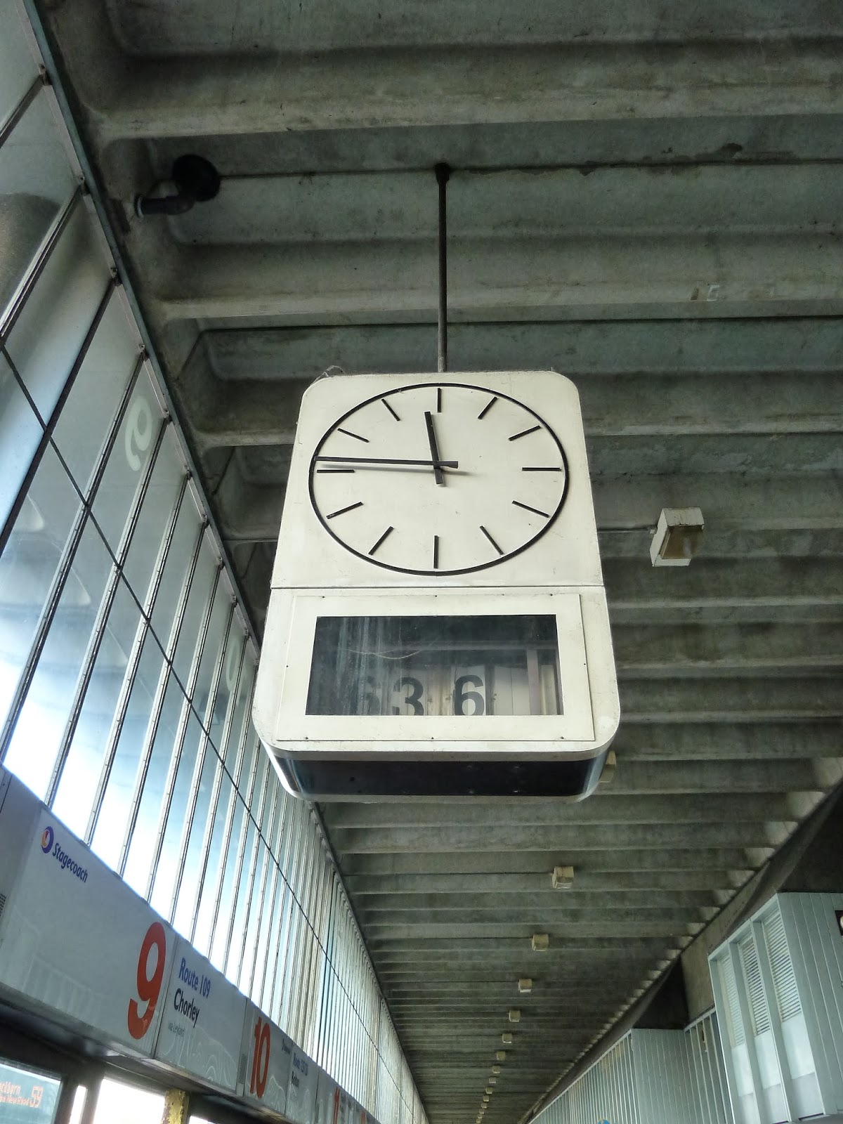
Returning to arriving at 6 - minutes past 63 / 14 minutes to 12


I returned to Preston on Friday 24th January and yet again I predictably headed straight for the Bus Station. I was still fixated with the Bus Station's informational 'Lost Property' i.e. missing letter parts and the missing coherence of the original, intended Helvetica typeface etc.  

The first thing I was drawn to this 'time' however wasn't the station's signage but it's timetable stands, some of which were void of time or direction but did include indicators used by the installers of the stands e.g. 'A'. 

'A' often seems like a good place to start.

These empty timetable stands were crying out for an intervention of some kind. The connection between the missing timetables and the missing 'correct' time on the station's clocks was something that interested me immediately.


Monday 17 February 2014

Returning signs


Returning to Preston Train Station to catch my train back, I was again reminded of the importance in keeping to the left of public passageways. Unfortunately as I walked up these stairs an oncoming large family walked into me and again scuppered my (this time lawful) path. Maybe one sign on every other step just isn't enough?

The A-Board Influx

On my way back to Preston Train Station I was confronted with A-Board clusters at particular pavement corners. Charles had pointed out the Preston City Centre A-Board influx, when I had my initial tour of Preston. Most of these A-boards are A2 in size, apart from the larger chalkboard in the photo below, peaking above. I wondered if anyone might purchase the available XL A-Board (H:152.4cm x W:91.44cm) in the future, then I wondered if I might make the XL A-Board in the near future?


The Book Stop's Here

I next found myself walking around the outdoor market, again in my element at the array of different styles of hand made signs. I then started to think of what my stall could be called, if I created one. I'm not sure I could 'out pun' 'The Book Stop's Here', but I would like to try to. This is definitely a point to be furthered.


Worl of Optics to Aladdin's Cove

After leaving the Bus Station Subway I started to find more signs with absent parts that sparked my interest, in view to carrying out repairs of sorts or as a start of different locative narratives. I found a Worl of Optics in the Guild Hall and also a couple of amazing ghost signs around the area outdoors. These ghost signs included the intriguingly named 'Aladdin's Cove' and the very pleasing to the eye Lambert Court Press sign. I'm interested in the places these signs once indicated, what they indicate now and what they could indicate with my appropriation or alongside particular interventions.


Through the Subway past Lo car ar (To the car park)

I headed out through the Bus Station Subway, this time with the intention of continuing my derive. I was immediately confronted with an oncoming pedestrian, who I walked into on the right hand side of the subway, underneath one of the intermittent 'Keep Left' signs installed....
After my minor lawlessness  I spotted some other signs in the subway which caught my interest. These signs had absent letters and letter parts, which led me to consider lettering repairs. A walk around further parts of the station later led me to other signs with missing lettering parts. Would I be allowed to restore these signs? Perhaps ironically not, due to the building's listed status? Temporarily though maybe? This was something to consider further.


Arriving at 6 - minutes past 63 / 14 minutes to 12

My derive was immediately faltered as I deliberately headed straight to Preston Bus Station. It was a predictable thing for a Sign Writer to do. I was so in ore of the signage when I had my initial tour of Preston with Charles and Elaine, that I had to go straight back there and gawp.
The array of contradictory signage in the Bus Station is incredible, I do not mean this at all in a derogatory way. The mixture of type styles are extremely disparate: from the infamously neutral Helvetica (matching it's neighbouring Swiss Design clock) alongside hand painted texts, vinyl texts and pasted up A4 paper signs. This variety of co-existing type styles was definitely something I needed to look into.


Outward travel must not be in the past

It was with the helpful advice of National Rail Enquiries, on Monday 13th January 2014, that I made my way to the City of Preston on my intended day of travel, rather than on the day that had just passed, as my memory failed me whilst accessing the Journey Planner. This was my first day in Preston to begin my research for my In Certain Places residency. Once managing to get the train to Preston on the correct day, I embarked on a derive around the City Centre, looking out for 'Signs of Interest'.